SCAT
Social Change Assistance Trust
BRAND IDENTITY | STATIONERY | WEBDESIGN | DOCUMENT DESIGN
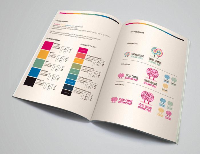
SCAT’s previous identity featured a tree and this was used as an appropriate starting point in the design of the new logo. The two trees are seen flowing into one another in a transformative dialogue and exchange. The forms of an ‘S’ and ‘C’ are contained in the logo. The empty space between the trunks is house shaped, symbolising security and a sense of place and belonging.


